Can you find all the sets of five positive whole numbers that have
a mean of 4
a median of 3
and a mode of 3?
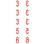
One solution is 3, 3, 3 ,5 and 6 and there are several other solutions.
There are 11 solutions with a single […]
This activity is about journeys to school, your own journeys and journeys to school by other children. Watch this video https://www.youtube.com/watch?v=rYA8SbqRwt8
The picture shows a 5 hour journey into the mountains on a narrow path to probably the most remote school in the world in Gulu, China.
The […]
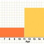
The histogram shows the number of children in each age group on a school bus. There are no children under 5 years and no children over 17 years. There are 6 children aged between 5 and 10 years . Explain why the class boundaries are 5, 11, 16 and 18. Complete the following table. […]
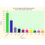
The graph and table show the Gross Domestic Products (GDP) of the world’s top ten economies in 2016 and the forecast for 2030.
Draw a double bar chart to compare the GDPs for these eleven countries in 2016 and 2030 (forecast).
Which countries are in the top […]
The table gives data on the land and sea covering the Earth’s surface.
(1) Explain how the percentage 69.03
(2) How would you use this percentage to find the angle for saltwater for drawing a pie chart?
A pie chart and a frequency bar chart are given below.
(3) Which of the […]
Two teams Alpha United and Beta Rovers have each played 15 matches.
The data shows how many goals the teams scored in their matches.
There are six sets of data, three showing the results for Alpha United and three for Beta Rovers.
Match the data to the teams and explain your answers.
[…]
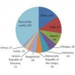
This United Nations Children’s Fund pie chart shows the global locations of 783 million people who did not have safe drinking water in 2012 and this number is increasing.
The total world population in 2017 is 7.5 billion (7,500,000,000). What percentage of the world population is without safe drinking water?
The world […]
Discuss these charts. The first was published in August 2020, and is similar to Florence Nightingale’s 1885 pie charts. In both charts the radial distance gives the number of deaths for a year and both were produced to convey a health warning and send messages to the British Government. What do you think these messages […]
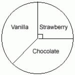
Xolile sells ice cream and the pie chart shows the sales for last week.
What fraction of the ice creams sold were strawberry? If she sold 60 strawberry ice creams how many ice creams were sold altogether.
The number of vanilla ice creams and the number of chocolate ice creams sold were the same.
[…]
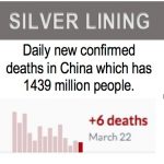
This is not an activity to do on your own. The suggested plan is that you take the discussion points one by one, perhaps one a week, and discuss them at school or at home. You might look at https://ourworldindata.org/coronavirus for the latest statistics when you have your discussion.
There is […]
South Africa COVID-19 News
Here is the official website for COVID-19 updates.
Login
SUPPORT AIMSSEC

