
Discuss these charts. The first was published in August 2020, and is similar to Florence Nightingale’s 1885 pie charts. In both charts the radial distance gives the number of deaths for a year and both were produced to convey a health warning and send messages to the British Government. What do you think these messages were?
The red line stops in August 2020; the big question is “what will happen to the red line in the rest of the year?” Use the internet to find the information you need to answer the question and continue the red line as far as you can. You might put a copy of this chart on the wall and add the new information to it week by week using a different colour for 2021. Make a similar chart for your own country.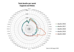
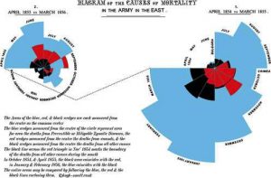 In Florence Nightingale’s charts, sent from the Crimean war zone, the areas of the blue wedges show the number of deaths of the British soldiers from avoidable diseases, the areas of the red wedges the numbers of deaths from wounds and the areas of the black wedges the number of deaths from other causes. The British Government commissioned Isambard Kingdom Brunel to design a prefabricated hospital that could be built in England and shipped to the Crimea. The new hospital, and the sanitary measures introduced by Florence Nightingale, reduced the number of avoidable deaths. Looking at the areas of the graphs for the two years, when do you think the new field hospital was opened?
This image shows the original charts drawn by Florence Nightingale from an exhibit in the British Library.
Sources: The Centre for Evidence Based Medicine https://www.cebm.net/
An anonymous SAP community blog.
The featured image of Florence Nightingale Redbubble
Florence Nightingale Museum https://www.florence-nightingale.co.uk/
If you enjoyed this article, please consider sharing it!


FOLLOW US ON SOCIAL MEDIA


