
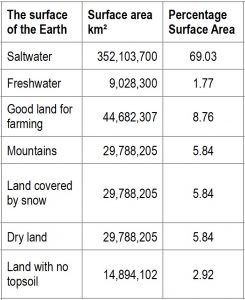
 The table gives data on the land and sea covering the Earth’s surface.
(1) Explain how the percentage 69.03
(2) How would you use this percentage to find the angle for saltwater for drawing a pie chart?
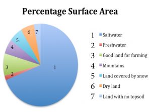
A pie chart and a frequency bar chart are given below.
(3) Which of the charts gives the best representation of the information in the table? Why?
(4) What can we learn from these statistics?
(5) What is the land like around where you live? What is it like in the rest of your country?
How does it affect your lives?
How does it affect economic development in your country?
Click here for the LAND AND SEA STATISTICS poster
Click here for the LAND AND SEA STATISTICS worksheet
Click here for the LAND AND SEA STATISTICS Inclusion Guide
Click here for the Notes for Teachers.
This was originally a lesson option organised by the Bubbly Maths team for the Biggest Ever Maths and Science Lesson attempt to break the Guinness World Record. These Lesson Notes for Teachers include more statistics about the continents, populations and population density and many ideas for lessons.
If you enjoyed this article, please consider sharing it!


FOLLOW US ON SOCIAL MEDIA


