
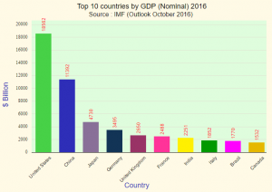
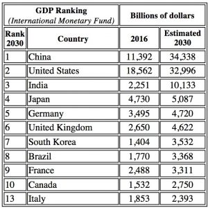
The graph and table show the Gross Domestic Products (GDP) of the world’s top ten economies in 2016 and the forecast for 2030.
Draw a double bar chart to compare the GDPs for these eleven countries in 2016 and 2030 (forecast).
Which countries are in the top ten in one of these years and not in the other? By how much does the GDP change for these countries between these two figures?
Which country makes the biggest increase in GDP? By how much does their GDP change?
Write down some of the things you notice from the data and some of the questions you might ask about what it shows.
You might like to comment on how it is that the amount of money appears to increase so much for all these countries in the 14 years.
Is the world getting richer and richer?
In 2020 there are big changes in GDP across the world due to the Coronavirus pandemic. Learners should use the internet or the references given in the Worksheet (link below) to find the latest information about the GDP of these countries. Include the 2020 figures in your table and bar chart.
How do you think the rest of the world might be affected by these figures?
Work with a group and make a poster to represent this data.
Click here for the A RICHER WORLD? worksheet.
Click here for the Notes for Teachers.
If you enjoyed this article, please consider sharing it!


FOLLOW US ON SOCIAL MEDIA


