
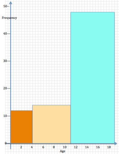
 The ages of children arriving at a zoo in 1 hour are noted by the ticket salesman. There are 12 children between 0 and 3 years old, 14 children between 4 and 10 years old and 48 between 11 and 18 years old.
He draws a bar graph or frequency diagram to represent this data.
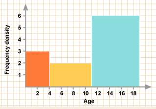
Kaya, one of the children, tells him that it would be better to represent the data in a histogram and she draws the diagram below.
Compare the two diagrams. What is the same and what is different about these two diagrams?
Explain how the frequencies are represented in each of the diagrams.
Which is the best representation?
Do you agree with Kaya or not? Give reasons.
Click here to download the BEST REPRESENTATION worksheet.
Click here to download the Notes for Teachers – Best Representation
If you enjoyed this article, please consider sharing it!


FOLLOW US ON SOCIAL MEDIA


