
 In 2018 Cape Town was in danger of running out of water. Half a billion people in the world face severe water scarcity all year round. Half of the world’s largest cities experience water scarcity
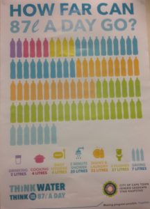
In 2018 the City of Cape Town rationed everyone to 87 litres a day and published this poster. A few weeks later they reduced the ration to 50 litres per person per day.
Explain what the pictograph shows.
Draw a bar graph from this data.
If you lived in Cape Town, where do you think you could save 37 litres from the 87 litre allocation?
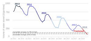
The graph below shows the total water stored in the Western Cape’s largest six dams from 30 June 2013 to 15 January 2018. Why do you think that the graph has this shape with peaks and troughs?
Click here to download the WATER CRISIS1 worksheet.
Click here for the Notes for Teachers.
Click here to download the WATER CRISIS 1 poster.
Click here to download the WATER CRISIS 2 poster.
If you enjoyed this article, please consider sharing it!


FOLLOW US ON SOCIAL MEDIA


